
The Four Methods of Information Visualization
In a digital world that’s constantly flowing with new information to consume, it’s time we learn about the different visual strategies of information presentation so we can get a better grasp of the visualization. Finding the kind of information visualization that you want to use to present information can make for a much stronger and clearer impact on the viewer. To learn more about yourself, try to find your type of visuals that you like viewing and making!
There are two main questions to determine a visualization type: What is being presented and why am I presenting it?
WHAT?
One of the differences you need to decipher in the information is exactly what the information is. It can either be conceptual or data-driven.
Conceptual: The information in conceptual presentations consists of ideas or concepts.
Data-Driven: This information can consist of any kind of data or statistics.
WHY?
The next piece to visual classification is determined in the purpose of its presentation. This is broken down into declarative and exploratory.
Declarative: The purpose of a declarative visualization is to inform the viewer of the information.
Exploratory: These visualizations are used to help discover patterns in the information.
Now, let’s see how each combination manifests in real examples!
Conceptual–Declarative
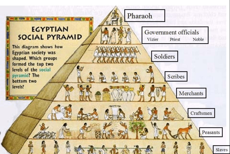
Also known as ‘idea illustration’, these presentations of information are described by Scott Berinato as simplifications of complex ideas by drawing on people’s ability to understand metaphors and simple conventions. By definition, this method informs the viewer about a certain concept or idea.
Look at the illustration below that details the social hierarchy of Egyptian social life. The image uses the common knowledge of visual hierarchy to clearly display the concept of Egyptian social life.
Conceptual–Exploratory
Also known as ‘idea generation’, this method is a preferred way to find themes and similarities in ideas. A common example of this method is mind-mapping and brainstorming. As a visual presentation, conceptual-exploratory visualization often seems to have less of a structure. It can be used to notice connections in information or even generate more.
In this example of a mind-map, you can see that it looks like more of an organized mess. It’s a method of branching rather than organization. The visual overlapping of images and words creates a clear message of similarity.

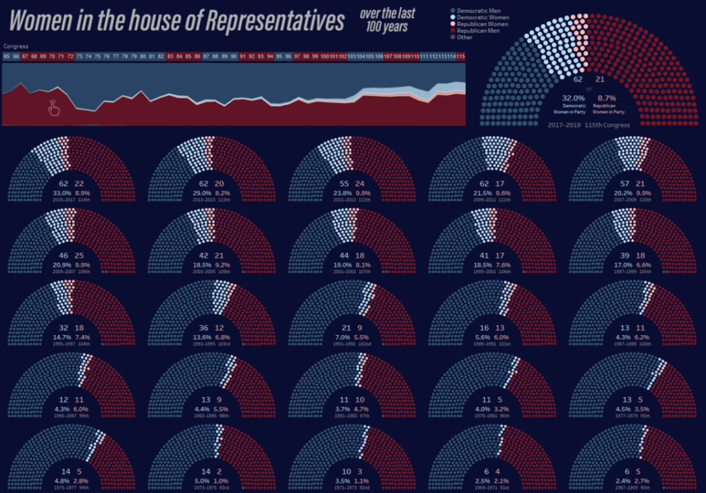
Data-Driven–Declarative
This method is the most basic of the four and is probably what pops into your head when thinking of data. By definition, it’s just a simple presentation of data. This can be used to just deliver facts. Data-driven-declarative visuals are often generic charts such as line graphs or pie charts.
However, I found a visual that delivers the historic statistics of women in the House of Representatives interestingly. This clearly pictures the data while there is no room for some kind of other interpretation.
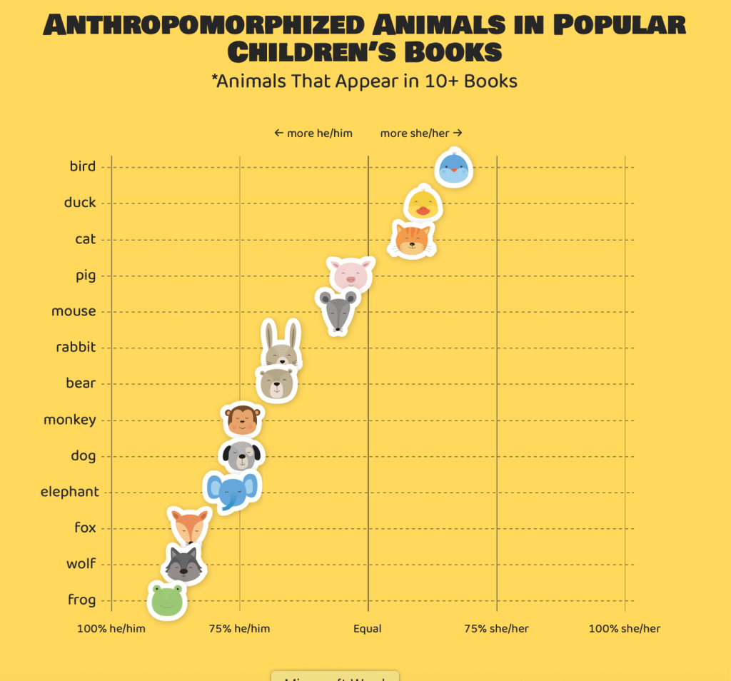
Data-Driven–Exploratory
Last but not least is this method to analyze and make sense of data. Similar to the conceptual exploratory method, this is a way to generate connections and find similarities in the information. It leaves the final conclusion about the data up to the viewer. It’s often interactive to encourage looking at the data in a different way.
The example below is a site that allows the viewer to explore the relationships between animals in children’s book and their gender. The author of the site proposes a question at the beginning, giving a clear mission for an answer through discovery in the data visual.
What’s your type?
Differentiating the four methods of information visualization can be a bit overwhelming to grasp. However, it’s clear that there are significant differences with each category. As David McCandless explains in his TEDTalk, we have tons of information right at our fingertips so, we all have a sense of design literacy. This means we are becoming more critical of information visuals the more we see. It’s most important now to connect the language of our eyes (what we see consciously and subconsciously) and the language of our minds (concepts and data interpretations). We can by recognizing the four methods of information visualization.

Leave a comment